
One thing I wish everyone would understand about web design
Design ≠ art. Art is about expression. Design has a goal it’s trying to reach. No need to be creative. Trying to be original leads to confused visitors, broken layouts and lost customers. Web design is simply about studying what works and what doesn’t, and doing the latter.
TL;DR VERSION IN VIDEO FORMAT
Please God no pic.twitter.com/vfhdgfaEya
— Peter (@Peter_M_V) October 10, 2022
DON'T LET ME BE MISUNDERSTOOD
We should try and be original in our copywriting, photography, illustrations and the ways we serve our visitors. Within some limits our typography as long as the text can still be read. We should however avoid being original with our navigation menus, our structure, our icons and usually our responsive layouts. People are used to specific patterns and we should take advantage of this – not go against it. An elevator where the buttons go 1,3,6,4,8,7,2,5 is original, but everyone will hate it.
MY FAVOURITE WEB SITE EVER
I live in Sörnäinen, Helsinki. There used to be a mexican restaurant called Artic Burrito nearby. It’s unfortunately now closed but their glorious website is still up. Here’s a screenshot:
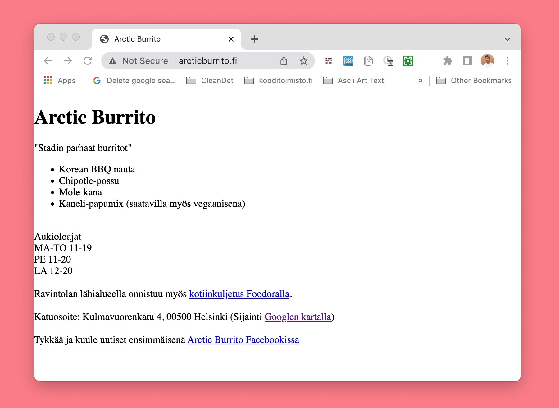
Address? Check.
Menu? Check.
Opening hours? Check
Google maps link? Check.
Delivery app link? Check.
Facebook link for checking availability? Check.
Vegan options? Check.
Perfect. 👌
The only things I’d change in this nearly perfect website would be a little bit of padding…

…an english version, a viewport meta tag to scale it better on mobile screens, an SSL certificate, maybe a social sharing image if we wanna be really fancy.
FRUSTRATION
I get frustrated when I see designers trying to be creative in the wrong places. Trying to be original and wasting our lovely clients money who trust us with their business. Design is not about trying to impress our peers or ranking a high score at the Awwwards.com. It’s about solving a business problem for our clients and doing that quickly and without waste. It’s about focusing on content and usability, not fancy cool hover effects or ”interesting” layouts. Interesting layouts either break on mobile screens or cost 20x more with no extra benefit.
Also, interesting layouts will lead to a layout breaking once you add one extra word to your heading. Maybe before 2007 when we didn’t have millions of screen sizes we had more freedom. Now, we need to be pragmatic.
“I JUST THOUGHT OF THIS REALLY COOL DESIGN”
There’s a reason no one else has used the creative solution you thought of. It’s because it sucks. It’s bad and visitors hate it.
Most designers simply do not know that their designs suck because they never test. They never hand over their creation to a random person and say “here, use this website” and just watch. If they did, reality would hit them hard. “I have no idea where the contact page is”. “It’s behind this creative icon you’ve never seen before! ”
A/B TESTING
How did Amazon.com become so successful? Well, not giving a single fuck about their employees or the planet is always good for business, but this time I’m talking about something called A/B split tests. Even if you never run an A/B test, as a designer you must understand the idea behind it.
Basically, we design two versions of our website. The first one says “Try our cool app” and the second one “Try our app – no account or credit card needed”. We show the first one to 50% and second to other 50%.
Then we wait. Results come in. The second one brought in 23% more customers. It’s then a superior one. It does not matter if you like the shorter text or dislike the colour red or like a pretty hidden navigation menu. It is not a matter of opinion. What’s better is better.
Why is this important? I see most designers making decisions based purely on aesthetics. Trying to make pretty, creative and original things, and 99% of the time, designing something frustrating and hard to use. But of course with cool animations and trendy gradients.
Even if you don’t have the budget to A/B test. Actually especially if you don’t have the budget – simply use what has been proven to work. Don’t try to be original and design a cool square-shaped steering wheel. Read a few articles from Nielsen Norman Group (they study usability and run AB tests so we don’t have to) and simply copy what has been proven to work.
DESIGN IS NOT ART.
It’s not art, it’s science. It can be measured. And even if you don’t have the budget to do so, you should still treat it as such. I’ve created art for the web too. It’s fun. It ended up in a fancy museum exhibition. But if you have a client, you have a responsibility.
DESIGN PATTERNS HAVE BEEN TESTED
Design patterns like an image carousel, hidden navigation, accordion or low contrast have been tested. Tested and compared like the covid vaccines. Others are more effective. Same with web design patterns. Our job is to know which ones work and which ones suck, and resist the temptation to be original. Except in copywriting, photography, illustration and the way we pair beautiful fonts together.
WHY?
Because our clients deserve better <3
Don't try to be original. Be simple. Be good technically, and if there is something in you, it will come out.
—Henri Matisse
I’m a designer more interested in solving business problems than following the latest trends on dribbble.com. If that sounds like your thing hit me up at @hire